- Google is rolling out a global redesign of the icons for Gmail, Drive, Calendar and the rest of Workspace, with more rounded shapes and color gradients.
- The company is abandoning the obligation to always use the four corporate colors, allowing each app to regain a predominant color and its own personality.
- The new icons function as a visual code to indicate that the applications integrate Gemini artificial intelligence functions.
- The change is being implemented quietly and progressively on Android, iOS and the web, prioritizing familiarity and visual accessibility for users in Europe and Spain.

If you have ever opened Google Drive thinking it was Gmail Or maybe you accidentally clicked on Google Meet when you meant Calendar? You weren't alone. In recent years, Google's push to unify the look of its icons with its four corporate colors ended up creating a rather annoying side effect: many apps looked almost identical at first glance.
That phase is coming to an end. The company has begun a A complete redesign of the icons for your Google Workspace applications. (Gmail, Calendar, Drive, Docs, Sheets, Slides, Meet, Chat, Tasks and more), with a clear focus: to improve the recognition of each service at a glance and, at the same time, make it clear that all these tools are powered by Gemini's artificial intelligence.
Goodbye to the tyranny of the four colors
The problem with the previous generation of icons was obvious: too much visual homogeneityAlmost all Google apps shared the exact same color palette (red, yellow, green, and blue) and very similar shapes, often enclosed in the same type of square container with rounded corners. The result, on both Android and iOS devices, was a grid of icons that were difficult to distinguish at a glance.
With the new redesign, Google breaks that unwritten rule of "cramming" the four colors into all symbols. Each application now features a predominant color and a more distinctive silhouetteThis gives a unique personality to services that, in practice, we use for very different things.
In addition, all the new icons incorporate color gradients instead of flat blocksThis change in visual texture, which had already been seen in the new Google "G", in Gemini or in Maps, is not just an aesthetic decision: it is the company's way of silently signaling that these applications are integrated with generative AI functions.
The focus is especially noticeable in Workspace, which is very widespread among private users, companies and public administrations in Spain and the rest of Europewhere Gmail, Calendar and Drive are already everyday tools both at work and in the personal sphere.
How the icons for Gmail, Drive, Calendar, and other apps change
Within this new wave of redesigns, there are several particularly striking examples. The overall goal is that, when looking at the mobile home screen or browser tabs, we can identify each Google service almost at a glance.
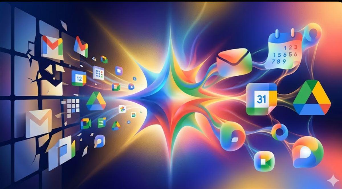
In the case of Google DriveThe classic triangle remains, but significant changes occur. The red disappears completely, and the icon is left with green, yellow, and blue—the same colors that identify [the brand/brand]. Docs, Sheets and SlidesThe triangle adopts softer, more rounded edges, and the gradient adds depth while remaining recognizable. With this, Drive visually aligns with the document, spreadsheet, and presentation editing tools.
Productivity apps Docs, Sheets and Slides They continue to use their single color (blue for documents, green for spreadsheets, and yellow for presentations), but there's an interesting twist: the Sheets and Slides icons are rotating towards a horizontal orientationThis more closely resembles the actual shape of a table or slide on screen. The inner symbol is made larger and clearer, with fewer embellishments, improving readability at small sizes.
The icon of gmail It is perhaps the most traditional case. It maintains the characteristic "M" shape reminiscent of an envelope and retains the four colors. However, the silhouette is softer, and the colors no longer appear as flat blocks, but rather as subtle gradients with red as the dominant toneIn this way, Gmail remains the focal point of the ecosystem, reinforcing its central role in email.
En Google Calendar The redesign is more nostalgic. The service brings back blue as its predominant color, with a design reminiscent of old desktop calendars. The confusing, multicolored container has been abandoned in favor of a clearer icon, where the day number and square shape are easier to identify quickly—key when checking the calendar on the go.
Communication apps are also being visually reorganized. Google Meet It leaves behind the "cocktail" of colors and is tinged with a solid yellow camera-shaped very obvious, while Google Chat It adopts green as its dominant color, in a nod to the old Hangouts, and a cleaner, more recognizable speech bubble shape.
Other services such as Tasks, Keep, Voice, Forms, or Sites They also receive updated icons, with larger symbols, fewer superfluous details and rounder outlines, designed to be clearly visible on both mobile phones and high-resolution computer screens.
Gradients and Gemini: Google's new AI visual signature
Beyond the appearance, what underlies this redesign is a change in visual language. The new Workspace icons reproduce the pattern that Google has been applying since 2025 in several key products: Replace solid color blocks with gradients that suggest movement and fluidity.
This gesture is directly related to Gemini, Google's generative artificial intelligence modelInstead of placing an explicit "AI" label within each app, the company prefers to use the gradient as a subtle code: when a user sees that color treatment, the implicit message is that the application integrates advanced capabilities, from assisted writing to data analysis or content generation.
The path to this visual language didn't begin with Workspace. First came the new Corporate "G" with gradient In 2025, the Gemini icon was added, and then services such as Google Photos, Home or MapsThe latter features a redesigned PIN that abandons block partitions in favor of a smooth gradient. Now, the aesthetic offensive is complete by bringing that same code to the most widely used productivity tools.
This approach aligns with a general trend in the technology sector: Gradients have become a recurring way to communicate the idea of AIAssociated with concepts like constant transformation, adaptability, and processes that unfold behind the scenes, Google aligns itself with other major companies while maintaining its recognizable four-color palette.
Essentially, Google is unifying products that already share a technological foundation under a single visual umbrella. Gmail, Calendar, Docs, Sheets, and Slides are integrated into Gemini with features such as text suggestions, automatic summaries, image generation, and natural language queries between services, and the new icon style acts as a surface “signature” for all those internal changes.
Readability, accessibility and daily life: why this change matters
It may seem that talking about the color of an icon is a minor issue, but for millions of people who open these apps several times a day, The visual clarity of the home screen has a direct impact on the experienceEspecially on mobile phones, where people check their email, calendar, or documents in a hurry, often while walking or traveling on public transport.
With ancient icons, the similarity between shapes and colors often forced Read the application name below the symbol to ensure they were entering the correct app. This was not only inconvenient, but also complicated matters for users with visual impairments or those who rely heavily on color recognition.
By assigning a predominant color to each application (blue for Calendar, red as the main color in Gmail, green for Chat, yellow for Meet, etc.), Google reinforces the quick association between color, shape, and functionWhen you glance at your phone, your brain can locate the app icon you need faster without having to look at the text.
These kinds of small optimizations, although invisible at first glance, improve accessibility, for example to Enlarge icons on the desktopand the speed of use in everyday situations. For users in Spain and Europe who rely on Workspace during their workday, avoiding that second of hesitation when searching for an icon on the screen can translate, throughout the day, into smoother navigation and fewer touch errors.
On the other hand, the decision to remove elements such as the old "page container" in many icons (that square frame that surrounded several symbols) allows each figure to better occupy the available space and be more clearly differentiated, something that is especially noticeable on screens with many shortcuts and on desktops with several open windows.
A silent and progressive rollout across the entire ecosystem
Google is carrying out this redesign in a way Silent and gradual, without big announcementsUnlike other companies that unveil their new icons in keynotes or specific campaigns, the strategy here is to update visual resources along with app versions and let people get used to them without turning the change into an event.
In practice, this means that the Deployment depends on each app's updates on Google Play and the App Store.Some users are already seeing the new icons for Gmail, Drive, Calendar, and Meet on their mobile phones and computers, while others will receive them in the coming weeks or months, depending on the update rate and region.
On Android, the icons are updated when the latest versions of Workspace apps are installed via Google Play. On iOS, the change occurs through updates in the App Store. In both cases, the user You don't have to take any specific action.Beyond simply keeping the apps up to date, users who need to revert to the previous style can... restore icons on Android.
Google has already applied this same pattern with the new "G", with Gemini, with Maps or with Photos: Progressive rollout, without a massive press releaseAnd enough time for the new design to settle in through sheer familiarity. It's the opposite approach to launches that generate noise and debate from day one, but it fits with a context in which many users are showing a certain weariness with constant AI-related announcements.
For those who prefer to maintain the old aesthetic, there is no official option to keep the previous iconsOn Android, some launchers allow you to manually customize icons, but this requires user intervention and is not part of Google's standard settings.
The brand logic behind a change that seems small
From a branding perspective, this redesign of Google's app icons is a Case study of how to update a widely used identity without breaking itThe company has opted for an approach based on three principles: maintain the overall form, change the textures first, and let the system distribute the changes without major announcements.
The basic shapes of the icons are kept familiar enough to avoid disorientation. Gmail is still an M, Drive is still a triangle, Calendar is still a square with a numberThe novelty lies in the way the colors are applied, in the gradients, in the loss of frames, and in small corrections of proportions.
By focusing the innovation on color transitions and the sense of depth, Google achieves update the aesthetics to current standards (where gradients have made a strong comeback) and, at the same time, use that resource to tell something about their technology: that Gemini's AI is already present in virtually their entire ecosystem.
There are also calculated risks, such as the decision to Remove the red from Drive After many years in which that color was part of the application's identity, Google is betting that the new consistency between Drive and the Docs/Sheets/Slides trio compensates for the loss of that historical color association, and that the new color balance will reinforce the perception of a family within Workspace.
For users, businesses, and designers in Europe, where Workspace is a well-established alternative to other productivity suites, these changes offer a A clear reference for how a visual identity can be migrated on a large scale without generating massive rejection: gradual changes, respect for recognizable forms and an underlying technological idea that justifies the effort.
Overall, the redesign of Google's app icons is more than just a simple facelift. It represents the Consolidation of the Gemini era at the heart of the company's productivity ecosystemIt reinforces readability and accessibility in the daily lives of users and marks a new stage in Google's visual identity, more flexible, more differentiated between services and, at the same time, more unified around artificial intelligence.
